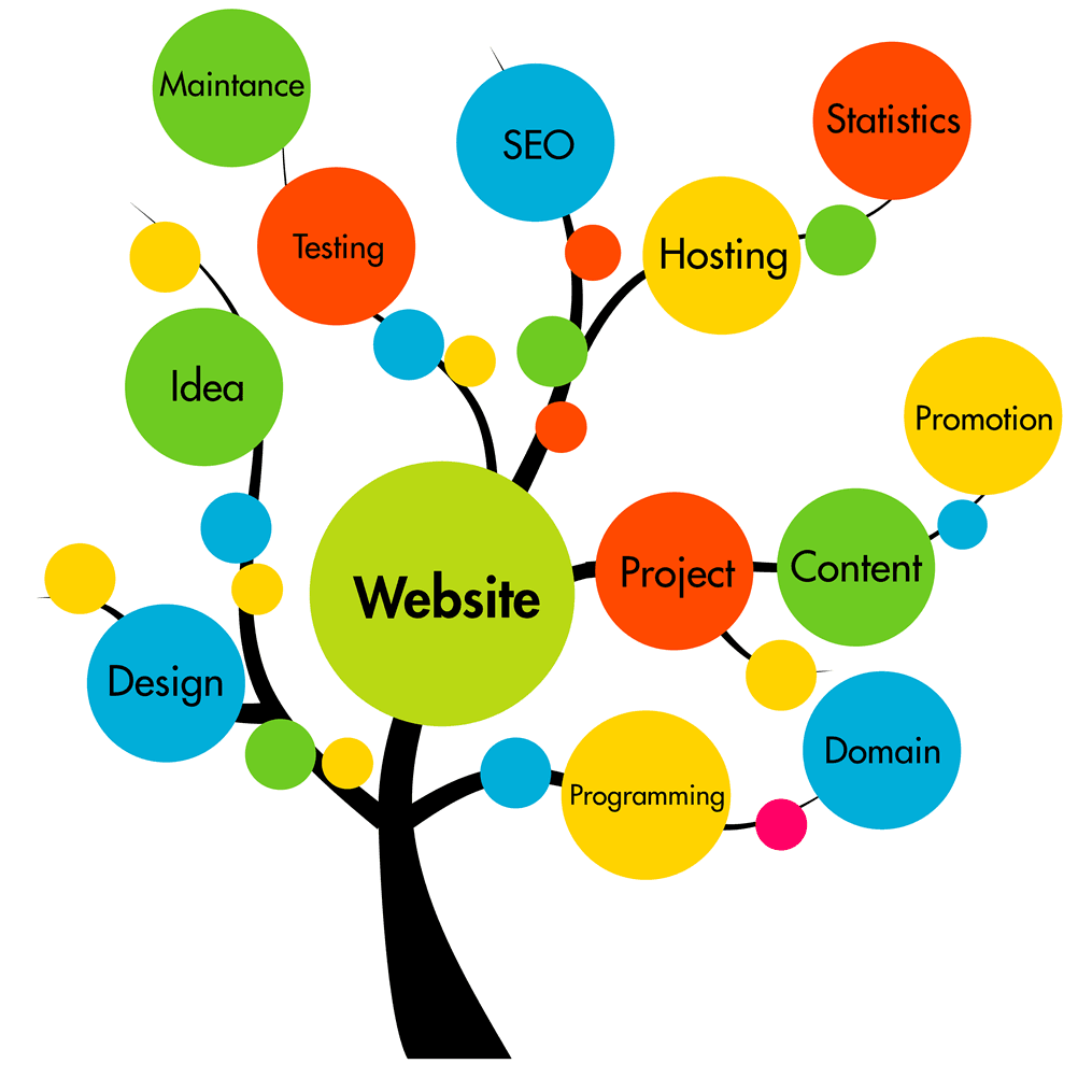

You actually don’t need a lot of money to design a quality website. You can achieve fantastic results with nothing more than careful planning and some effort. However, we still frequently run into amateurish websites that fail to avoid these 7 common web design mistakes small businesses make. Carefully go through our list and see how many of these you can recognize on your website.
The most important purpose your website provides your users isn’t letting them purchase your products. That part typically comes later since not everyone who visits your site will be ready to make an immediate purchase.
This is why you need to offer users other reasons to visit your site. Having quality content on your site will be the biggest draw. Write informative and researched articles, which you can later use for online marketing to bring even more users to your website.
Search engines can recognize websites that fail to offer any real value to their visitors. These sites usually have a hard time achieving a high rank on SERPs. Therefore, if you want to boost your SEO, you should start creating interesting and engaging content.

When it comes to common web design mistakes small businesses make, we often see website owners set up a semi-functional site and just leave it at that. As long as the owner is happy and the website is working, they don’t mind if the design stays the same forever. Unfortunately, that’s not the best way to get the most out of your website. You need to carefully track your conversion rate to see how your website is performing. If your landing page isn’t achieving the numbers you are expecting, you might want to transform your current website into something a bit more modern. You can try out several different web designs to determine which has the best conversion rates.
What’s important is that you start paying attention to the different elements on your site and how users react to them. A lot can be done through optimization and testing, so you should always be on the lookout for more effective solutions.
A clear call to action is one of the most important elements of your site. It informs website visitors of what you want them to do and inspires them to act. First of all, you need to determine which action you want users to perform when they reach your site. Then you need to have your entire web design come together to support that. This includes your content which should be geared towards making your proposition sound good. However, the centerpiece is the Call to Action itself. Avoid generic copy text, and instead, use something that will frame your CTA in a positive light.

You have to realize that your website simply can’t include everything. However, many website designers try to jam in as many features as possible. We like to call this the kitchen sink approach, and it’s one of the most common design mistakes small businesses make.
You might see a cool new website feature that is currently trending, so you’ll want to add that to your site. Perhaps you also read that widgets are a good idea, so you cram a few of those in as well. Now you are also considering placing ads on your pages for additional revenue. While none of these ideas are bad on their own – you shouldn’t try to make your website do everything. That can lead to a confusing design that may drive users away.
Designing a website with too many features also looks very outdated and unappealing, and it won’t help you attract new customers. When you look at the websites of major brands, you’ll notice a trend where most of them adopted a minimalist design philosophy.
This is another problem we frequently run into, and it’s very typical for cheap and amateur web designers. While self-taught web designers and beginners might be able to code a site, some of them severely lack aesthetic design education. As a result, this can leave websites looking ugly.
When many of the aesthetic choices are poorly matched together, there is often a lack of cohesive theming. The same can be said about strange font choices that make the text on your website hard to read. All of your design choices need to improve the usability of your website, not impede it. Pick colors and fonts that will ease navigation for visually impaired users.
It’s imperative that you have a contact page on your website. Ideally, you should leave multiple ways for users to reach out to you. This should, of course, include phone and email, but also links to social media platforms. However, you need to keep in mind that you should respond to all user questions and comments. Leaving unanswered questions on your website or social network profiles is just in bad taste. Additionally, it can drive away other potential customers if they see that you are unwilling to respond.

Consider having a section of your website dedicated to answering some of the most common questions regarding your products and services. Having an FAQ section comes with numerous benefits:
The key to any successful business is having a strong online presence. The fact that your business is small shouldn’t prevent you from having a fantastic website. Avoid these seven common web design mistakes small businesses make and you’ll start seeing more website visitors and a boost in your sales.


Not ready to commit yet?
I get it.
Get my free guide:
"15 Warning Signs Your Website Is Holding You Back"