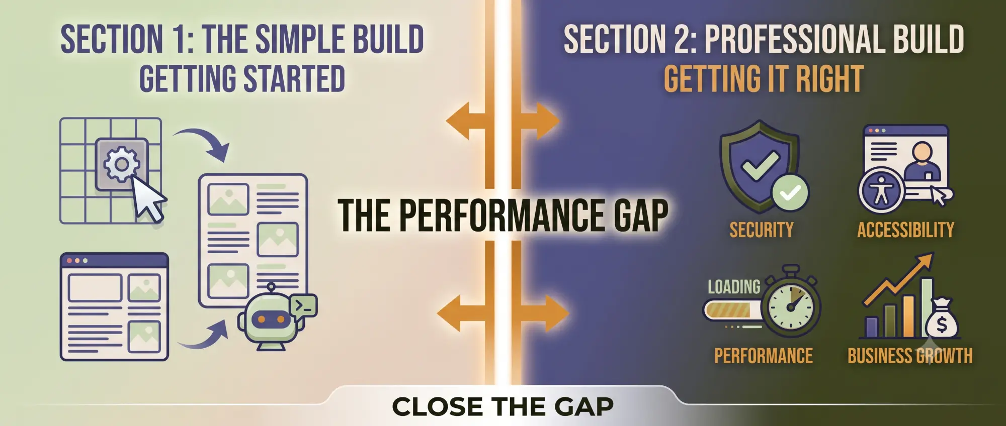

April is National Volunteer Appreciation Month, which means most nonprofits, museums, and cultural institutions will spend time this month celebrating their volunteers. Social posts. Thank-you emails. Maybe a reception.
And then the month will end, and their website’s volunteer page will go back to doing the same quiet thing it’s been doing all year: converting. Or trying to.
That’s worth pausing on.
Before we get to websites, it helps to be direct about what volunteers actually are, not just operationally, but institutionally.
For nonprofits and cultural institutions, volunteers are infrastructure.
They extend capacity in ways that paid staff cannot. They bring community credibility that no marketing budget can purchase. They represent years of relationship-building, institutional trust, and mission alignment that funders, board members, and partners use, consciously or not, to assess organizational health.
Consider what volunteers typically carry:
None of this is new information for people who work in this sector. What’s less often examined is how rarely this reality shows up on the organization’s public face, its website.
Here’s what a typical nonprofit or museum volunteer page looks like:
A headline. Something like Make a Difference or Join Our Team of Volunteers.
A short paragraph about impact. Usually vague. “Volunteers are the heart of our organization.”
A form. Name, email, areas of interest, submit.
That’s it.
No faces. No stories. No data about what volunteers actually do or how long they’ve been involved. No sense of what the organization would look like without them.
This is a missed opportunity, but it’s also an unintentional communication problem.
When a sophisticated reader, a foundation program officer, a prospective board member, a major donor doing quiet due diligence, visits your volunteer page and finds a form with a paragraph, they don’t consciously think this organization doesn’t value its volunteers. But they register something.
The page is thin. The relationship feels transactional. The depth they’re looking for isn’t there.
A volunteer page that treats volunteers as a conversion goal communicates: we haven’t thought carefully about what our community relationship looks like from the outside.
That’s a credibility gap. And it exists on a lot of websites right now.
Organizations with strong credibility infrastructure, the ones that make funders feel confident, that attract serious board candidates, that feel like they’re built to last, treat their volunteer section differently.
They treat it as an organizational portrait.
Not a recruitment funnel. A portrait. A window into the depth, trust, and community embeddedness that no staff bio page can replicate.
Here’s what that looks like in practice:
It includes specificity, not just sentiment.
“We’ve had volunteers with us for 15 years.” That sentence does more work than three paragraphs about making a difference. It tells a reader: people come here and they stay. Something about this place earns that kind of loyalty.
“Our docent corps trained over 200 hours last year.” That tells a reader: we invest in the people who invest in us. This isn’t a plug-and-play operation.
“One in three of our board members started as a volunteer.” That tells a reader: leadership here comes from community. The pipeline is internal. The culture rewards commitment.
These aren’t warm stories for their own sake. They’re credibility signals, and they’re most valuable to exactly the kind of reader you most want to influence.
It makes the relationship visible, not just the form.
Photos of real volunteers doing real work. Brief quotes from people who have stayed for years. A clear explanation of what different volunteer roles actually involve, not just a list of titles, but a sense of the work and its meaning.
It communicates continuity.
One of the quietest signals of organizational health is whether people come back. A volunteer page that mentions multi-year involvement, cohort training, or volunteer leadership says: we’re not just cycling through warm bodies. We have a community that has chosen to stay.
If you’re rethinking how your organization talks about volunteers, online and off, here are the questions we hear most often, answered directly.
Why do nonprofits and museums rely on volunteers so heavily?
Because the work of mission-driven organizations is almost always larger than the paid capacity to do it. Museums need docents to make education programming possible at scale. Food banks need distribution volunteers to meet demand. Advocacy organizations need canvassers and phone bankers to reach communities. The mission exceeds the budget, volunteers bridge that gap.
But it’s also more than logistics. Volunteers represent community buy-in. They are people who have decided, unprompted by a paycheck, that this organization’s work matters enough to give their time to. That’s a form of endorsement that carries real weight.
How do volunteers help organizations grow?
In several specific ways:
Growth in the nonprofit and cultural institution context isn’t just financial. It’s relational, reputational, and structural. Volunteers contribute to all of it.
What makes a volunteer program sustainable?
Three things, consistently: clear roles, meaningful recognition, and demonstrated impact.
Volunteers stay when:
Organizations that struggle with retention usually have a gap in at least one of those areas.
On the website side: if your volunteer page doesn’t communicate any of those three things, you may be attracting the right people and not giving them enough reason to follow through.
Does the volunteer page really affect how funders see us?
Yes, though rarely consciously.
Foundation program officers, individual major donors, and institutional partners typically review an organization’s full website before a site visit, meeting, or grant decision. They’re not auditing your volunteer page. But they’re forming an impression of organizational depth.
A thin volunteer page that says little about relationships and much about forms leaves a gap in that impression.
A volunteer section that communicates longevity, training investment, and community embeddedness fills it.
When should we update our volunteer content?
Volunteer Appreciation Month is a natural prompt, but the real answer is: whenever your website no longer accurately reflects your relationships. If your volunteers have been with you for years and your website treats them like prospects, the gap is already there. It’s just not visible to you the way it is to a first-time visitor.
A website audit is a good first step. You don’t need to rebuild everything. Often, a few specific additions – a quote, a data point, a photo, a paragraph about what your volunteer community has built – changes the impression significantly.
Volunteer Month is a natural prompt to ask a harder question: does our website actually reflect the depth of this relationship?
Not just the volunteer page, though start there. Consider how volunteers appear across your site.
Are they mentioned in your About section?
Do they appear in program descriptions?
Are they visible in your impact reporting?
If the answer is mostly no, that’s useful information. It means your public-facing organizational portrait is missing a layer that funders, partners, and community members are looking for.
The organizations that communicate this well aren’t necessarily the largest or best-resourced. They’re the ones that have thought carefully about what their website says about who they are, not just what they do.
If you’re not sure how your website currently reflects your volunteer relationships, or your organizational depth more broadly, a Website Clarity Snapshot is a good starting point. It’s a focused review of how your site communicates trust, credibility, and community to the readers who matter most.
Volunteers don’t stay for the form. They stay because something about the organization earned their loyalty over time.
Your website should say that, clearly, specifically, and year-round. Not just in April.
Volunteer Appreciation Month is a natural prompt, but the real answer is whenever your website no longer accurately reflects your relationships. If your volunteers have been with you for years and your website treats them like prospects, the gap is already there. It’s just not visible to you the way it is to a first-time visitor. A focused website review is often the fastest way to surface where the disconnect lives.
Not always consciously, but yes. Foundation program officers and institutional partners typically review an organization’s full website before a site visit, meeting, or grant decision. They’re not auditing your volunteer page. But they’re forming an impression of organizational depth. A thin page that says little about relationships leaves a gap in that impression. A section that communicates longevity, training investment, and community embeddedness fills it.
A recruiting page is designed to convert. It answers: how do I sign up? A credibility page is designed to communicate. It answers: what does this organization’s relationship with its community actually look like? The strongest volunteer sections do both, they make it easy to sign up and they tell a story that makes a thoughtful reader think: this organization has built something real. The distinction is whether you’re treating volunteers as prospects or as evidence.
At minimum: a clear explanation of what volunteers actually do, not just a list of role titles. Beyond that, the elements that shift the impression most are specificity and continuity, a data point about training hours or tenure, a quote from a long-term volunteer, a photo of real people doing real work, and a brief acknowledgment of what the organization would look like without its volunteer community. None of this requires a redesign. It requires editorial attention.
Frances Naty Go is the founder of Goldlilys Media, where she helps mission-driven organizations turn their websites into clear, durable systems that support meaningful work over time. She works with museums, nonprofits, health and wellness brands, higher education, life sciences, travel organizations, and expert-led businesses.
With a background in Computer Science from UC San Diego, Frances brings a thoughtful, strategic approach to building digital experiences that educate, orient, and build trust, without unnecessary complexity.


Questions first? Start a conversation