
When Forever Balboa Park reopened its newly renovated Botanical Building and Central Gardens, the Garden Party became the public’s first invitation back. This is how we helped the event pages rise to that occasion, using only what the brand already had.
Forever Balboa Park is the nonprofit supporting Balboa Park, the Botanical Building, and the Central Gardens in San Diego. After a significant renovation, the Botanical Building and its surrounding gardens were reopening to the public, and the Balboa Park Garden Party was chosen as the inaugural launch event. For many in the community, it would be their first invitation to experience the restored space.
The event page lived on two separate sites: the main Forever Balboa Park organization site and the dedicated Balboa Park Botanical site. Both needed to serve the same audiences, individuals considering a $350 ticket and organizations weighing a meaningful sponsorship investment, while fitting within their respective existing WordPress and Elementor systems.
This was not a redesign. The brand colors stayed exactly as the organization’s staff defined them. The structure, the green palette, the typography, all of it remained consistent with what already existed. The goal was to help the pages perform at the level the moment required, using only what the brand already had.
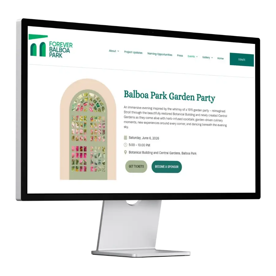
The event itself was genuinely compelling, an immersive evening inspired by the spirit of a 1915 garden party, set inside a beautifully restored botanical landmark. The organization was deliberate about positioning it as something different: not a traditional fundraising gala, but an experience worth attending on its own terms.
That distinction needed to be present in the pages. It wasn’t.
The green palette was intact. The logo was right. The content was accurate. But the sections felt flat and uniformly weighted. The sponsorship opportunities didn’t communicate relative value clearly. And the overall structure read like a general extension of the broader site rather than an invitation to something specific and rare.
For a $350 individual ticket or a corporate sponsorship investment, a visitor needs to feel the event before they commit. The pages weren’t doing that, not because of what colors were used, but because of how the existing system was structured.
The brand was right. The structure wasn’t carrying it.
The staff had clear direction: stay true to the organization’s existing green palette. No new colors, no brand deviation. That constraint turned out to be clarifying.
It meant the entire experiential lift had to come from structure, section backgrounds varied across the existing green range, wave-shaped dividers creating rhythm and movement between sections, a historic photograph of the Botanical Building used as an atmospheric closing banner, card layouts that gave the “What to Expect” and sponsorship content visual weight and clarity. Consistent botanical imagery tied the page together as a cohesive experience rather than a sequence of separate blocks.
Nothing outside the brand was introduced. Everything changed in how the brand was applied.
This is a pattern worth naming: organizations often assume that improving a digital experience means changing their visual identity. It rarely does. The more common need is using what already exists with greater intention, more contrast between sections, more deliberate hierarchy, more considered pacing. The brand stays. The experience improves.
Before: The opening sections communicated event details but not occasion. They read as announcements.
After: The hero establishes atmosphere immediately, an immersive evening, a restored landmark, an inaugural event worth attending.
Before: Sections carried equal visual weight throughout. The page had no rhythm, no variation in pace, no sense of movement.
After: Wave dividers and alternating section backgrounds within the existing green palette create movement. The page has shape and sequence.
Before: Individual and sponsor audiences encountered the same undifferentiated structure. Neither felt specifically addressed or guided.
After: The page structure guides each audience clearly, ticket buyers toward the experience, sponsors toward their opportunity.
Before: Sponsorship categories were presented descriptively, without visual distinction between the nature of each opportunity.
After: Four sponsorship types, brand integration, food and beverage, music and garden moments, hosted lounges, each read as a distinct and considered option.
Before: The event experience was described factually. The richness of the evening wasn’t landing experientially.
After: The “What to Expect” section on the deep green background earns the ticket price emotionally before the pricing section asks for it.
Before: The pages had no strong closing moment. Visitors reached the end without a clear sense of what to do next.
After: A full-width atmospheric banner using a historic photograph of the Botanical Building closes the page with weight, and two clear calls to action.
Working closely within both sites made broader operational friction visible. Routine content updates required more effort than they should within Elementor. Maintaining visual consistency across two related but separate sites, with different templates, global styles, and editing constraints, added coordination overhead that accumulated quietly over time.
These are common findings for organizations managing WordPress sites that have grown over several years. A conversation emerged about eventually consolidating and rebuilding on a more maintainable foundation, not because it was proposed, but because careful work made the friction visible.
That distinction matters. The goal of a well-executed project isn’t just to improve what’s in scope. It’s to leave the organization with a clearer picture of what they’re working with, and what they might want to address next.
This project was two pages. What it demonstrated was a way of thinking: about structure, about the weight of a launch moment, about what it means to serve an organization’s audience well within the system and the brand that already exist.
The staff knew their colors. They knew their identity. What the pages needed was for that identity to be applied with more intention, more contrast, more hierarchy, more deliberate pacing. That’s what we provided.
That’s what we do. Carefully, and with long-term usefulness in mind.


Questions first? Start a conversation