
If you lead a life sciences or research-focused organization, your website probably carries more responsibility than it did a few years ago.
It’s not just a place to describe your work.
It’s where investors look for signals of maturity.
Where partners evaluate capability.
Where peers review leadership.
Where media and stakeholders confirm credibility.
In this space, clarity matters.
When your website feels cluttered, overly technical, or too promotional, it creates friction.
Not because the science isn’t strong.
But because the structure doesn’t reflect it.
Most organizations don’t suddenly decide to redesign.
The change happens gradually.
Research evolves.
Milestones stack up.
Teams grow. Messaging expands.
Over time, the website becomes harder to navigate and harder to update.
Technical content feels dense.
Investor information feels buried.
Leadership pages feel outdated.
Eventually, the site no longer reflects the level you’re operating at.
That’s not a design issue.
It’s an alignment issue.
A well-structured website should:
It shouldn’t oversimplify your science.
But it shouldn’t overwhelm visitors either.
It should feel clear.
Measured.
Credible.
We build website masterpieces for life sciences and innovation organizations, durable trust systems built for what comes next.
That starts with clarity.
Before visuals.
Before features.
Before design direction.
We clarify:
This isn’t about visibility.
It’s about presenting your work with the level of rigor it deserves.
If you’re advancing research, preparing for funding, expanding partnerships, or increasing public visibility, your website should reflect that shift.
The real question isn’t:
“Do we need a new site?”
It’s:
“Does our website reflect the level of work we’re doing now?”
If that answer feels uncertain, you’re not facing a marketing problem.
You’re facing a clarity problem.
And clarity always comes before execution.

Not ready to commit yet?
I get it.
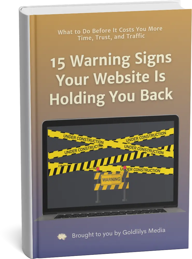
Get my free guide:
"15 Warning Signs Your Website Is Holding You Back"