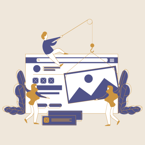
A customer journey map is a visual guide to how your audience discovers, interacts with, and engages with your website. It helps you design experiences that feel intuitive and persuasive.
Journey mapping makes your website more strategic by revealing audience needs and pain points. This allows you to create content, navigation, and calls-to-action that guide visitors toward meaningful outcomes like donations, bookings, or purchases.
By aligning branding, UX, and functionality with your audience’s path, journey mapping transforms curiosity into commitment, turning your website into a masterpiece that inspires action.
“It is good to have an end to journey toward; but it is the journey that matters, in the end.” – Ursula K. Le Guin
Every person who lands on your website got there somehow. Maybe they Googled “science museums near me” while planning a weekend activity. Perhaps they’re frantically searching for mental health resources at 2 AM. Or they could be a researcher who’s been comparing biotech companies for weeks before finally clicking your link.
Here’s the thing: most websites are built from the inside out. We organize them based on our org charts, our priorities, our assumptions about what people need. But what if we flipped that script? What if we built websites based on actual human behavior?
That’s where journey mapping comes in, and honestly, it’s been a game-changer for how we approach our Brand, Build, and Beta process at Goldlilys Media.
Let’s skip the jargon. A journey map is basically a play-by-play of someone’s entire experience with your organization. It’s not just about what buttons they click, it’s about what they’re thinking, feeling, and trying to accomplish at each step.
Imagine you’re watching someone over their shoulder (in a non-creepy way) from the moment they first hear about you until they become your biggest fan. What would you see? What would surprise you? That’s journey mapping.
Here’s a real scenario we encountered with a nonprofit client. They assumed most website visitors were potential donors. Makes sense, right? So they optimized everything for donations, big donate buttons, impact stories, financial reports front and center.
But when we actually mapped user journeys, plot twist! The majority of visitors were people seeking services. They were in crisis, needed help fast, and kept bouncing off the site because they couldn’t quickly find what they needed. All those donation appeals? They were just obstacles.
Meanwhile, the actual donors? They typically visited 3-4 times before giving, often starting with program information, not financial data.
After working with everyone from museums to biotech startups, we’ve spotted some fascinating patterns:
Museums and Cultural Spots deal with what we call “the planning paradox.” Half their visitors plan visits weeks in advance (checking everything from parking to gift shop hours), while the other half are standing outside going “Are they open?” These aren’t just different audiences, they’re people in completely different mindsets.
Healthcare and Life Science Companies have it tough. They’re serving PhD researchers who want every technical detail AND patients’ families who just need to know “Will this help mom?” Same website, wildly different journeys. It’s like trying to write a book that’s both a thriller and a technical manual.
Theatre and Performing Arts Groups have seasonal personality disorders (in the best way). During subscription season, people want to plan their entire year. During show runs, they want tonight’s tickets NOW. And don’t get me started on the journey of someone trying to buy a gift subscription, that’s its own adventure.
Small Businesses, especially in health and wellness, often miss how much detective work their customers do before reaching out. People aren’t just checking your services, they’re stalking your Instagram, reading every review, and probably asking their friend who mentioned you once six months ago. Your website needs to support this investigation, not fight it.
When we kick off the Brand phase, we basically become detectives. But instead of solving crimes, we’re solving questions like:
One wellness brand discovered their ideal clients weren’t finding them through wellness searches at all, they were finding them through productivity and business coaching content. That completely changed their content strategy.
Once you know the journey, building becomes so much clearer. It’s like the difference between wandering through a maze and having a map.
Multiple Front Doors: People don’t always use your homepage. (Shocking, I know.) That blog post from 2019? Someone’s landing there from Google right now. Every page needs to work as a potential starting point.
The Lunch Break Test: Can someone accomplish their goal during a hurried lunch break? A tourism board realized most trip planning happened during work breaks, so they created “quick plan” features that saved progress for later.
Breadcrumbs Everywhere: Not the navigation kind (though those are good too). I mean clues about what to do next. If someone just read about your education programs, what would they logically want to know next? Put that right there.
Trust Building in Layers: You can’t just slap a “Trust us!” banner on your site. Healthcare organizations especially need to build credibility gradually, a credential here, a testimonial there, transparency when it matters most.
This is where things get really interesting. Beta testing with journey maps is like watching your assumptions get a reality check.
We had a museum convinced their virtual tour was for out-of-town tourists. Turns out? Mostly used by teachers planning field trips and people with mobility concerns checking accessibility. Same feature, completely different journey than expected.
A biotech company discovered people weren’t abandoning their contact form because it was too long, they were leaving to find one specific piece of information the form didn’t explain. Adding one sentence increased completions by 40%.
Here’s what nobody tells you about journey mapping: it changes more than your website. When everyone from your receptionist to your CEO understands these journeys, magic happens:
Want to start journey mapping without hiring consultants or buying expensive software? Here’s your starter pack:
Have Real Conversations: Talk to 5-10 actual humans from each audience group. Don’t send a survey, have real conversations. Ask them to tell you the whole story of finding and using services like yours.
Stalker Mode: Analytics Edition: Dive into your Google Analytics. Look for patterns. Where do people enter? Where do they bail? What paths do they take? It’s like reading tea leaves, but with data.
The Emotion Timeline: For each step in the journey, write down how someone probably feels. Confused at step 3? Relieved at step 5? Those emotions are design opportunities.
Find the “Make or Break” Moments: There are usually 2-3 points where people either commit or quit. Find them. Obsess over them. Perfect them.
Test with Humans, Not Hunches: Get real people to try real tasks on your site. Watch them. Take notes. Prepare to be surprised.
Look, we’ve all visited websites that made us want to throw our laptops out the window. They’re usually the ones designed by committee, built on assumptions, and never tested with actual humans.
Journey mapping isn’t some mystical process, it’s just paying attention to how real people actually behave. When you build around real journeys instead of imaginary ones, you create websites that actually work.
At Goldlilys Media, we’ve watched journey-mapped websites transform organizations. Museums see more visitors and members. Nonprofits connect with people who need them most. Small businesses punch above their weight class. Not because of fancy features or bigger budgets, but because they finally understood the humans on the other side of the screen.
Your website visitors are on a journey whether you’ve mapped it or not. The question is: are you going to help them along, or make them figure it out themselves?
Ready to create something that actually makes sense to the humans using it? Let’s talk about mapping your way to a website that works.
“The only impossible journey is the one you never begin.” – Tony Robbins

Frances Naty Go is the founder of Goldlilys Media, where she helps mission-driven organizations turn their websites into clear, durable systems that support meaningful work over time. She works with museums, nonprofits, health and wellness brands, higher education, life sciences, travel organizations, and expert-led businesses.
With a background in Computer Science from UC San Diego, Frances brings a thoughtful, strategic approach to building digital experiences that educate, orient, and build trust, without unnecessary complexity.


Not ready to commit yet?
I get it.
Get my free guide:
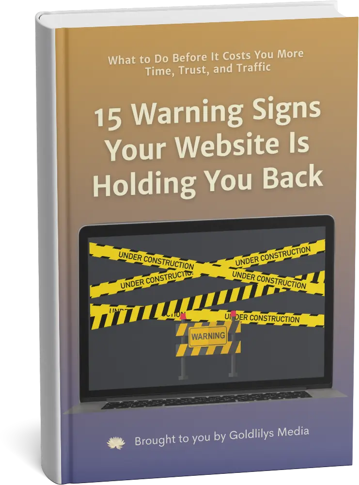
"15 Warning Signs Your Website Is Holding You Back"