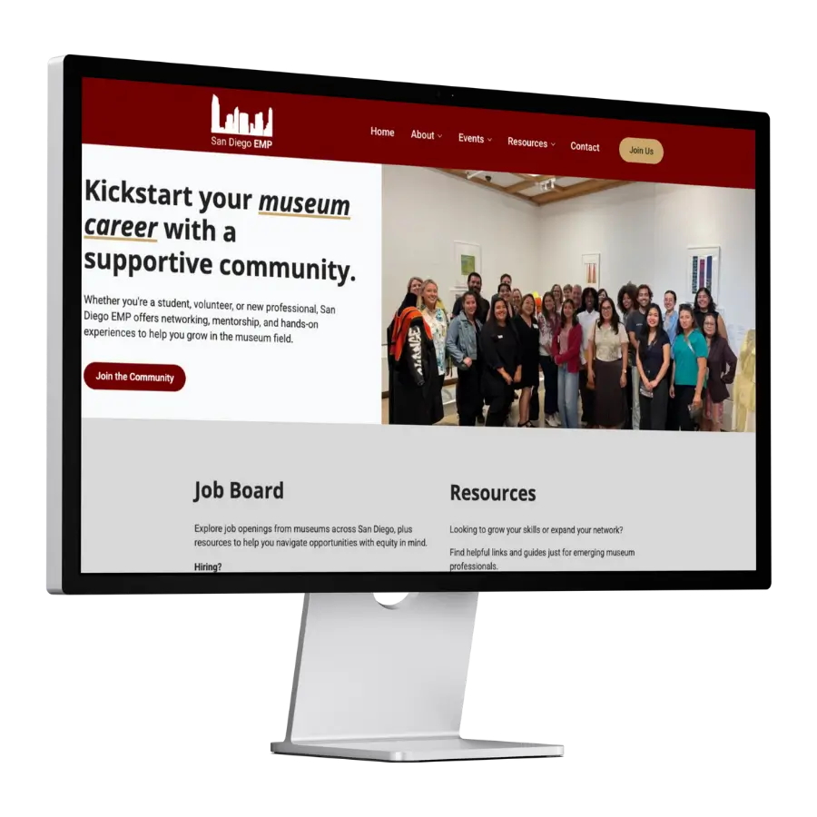
San Diego Emerging Museum Professionals
The situation, before
The site’s branding was already working and recognized by the community, the board had no interest in changing it. The actual condition was operational: adding an event was a cumbersome enough process that it discouraged frequent updates, and visitors sometimes couldn’t find the information they came for.
For a board-run membership organization with no dedicated web staff, that meant the site’s currency depended on how much friction one or two volunteers were willing to push through.
The real problem diagnosed
The board framed the request as wanting an easier way to manage content. The underlying failure was narrower and more consequential: the backend architecture made event posting dependent on technical comfort, not on whether there was an event to announce.
That gap between what was actually happening in the organization and what the site showed is a credibility problem for a group whose entire value proposition is being an active, current professional community.
What was at stake
A professional community is judged by whether it looks alive. Infrequent event postings read as an inactive organization even when the opposite is true, which affects how prospective members and partner institutions perceive SDEMP at a glance. Leaving the backend as-is also meant the board stayed dependent on whoever was technically comfortable enough to fight through the update process, a single point of failure for an all-volunteer structure.
The path forward
Because the brand was already doing its job, it was treated as fixed, not reworked. The sequence started with the backend: rebuilding content management, especially event creation, so board members could publish without touching code. Navigation was restructured next, so visitors could reach events, resources, and board information directly. Accessibility, SEO, and performance upgrades were layered on last, once the operational core no longer depended on one person’s patience.
What was built
A custom backend built specifically to make event creation and content updates fast, resolving the friction that had been suppressing how often the board posted. A dedicated board member section requiring no coding knowledge, removing the single-person dependency on future updates. Streamlined navigation to events, resources, and board information, resolving the visitor-side difficulty finding what they came for. ADA accessibility upgrades, extending who can use the site without friction.
SEO improvements, increasing visibility to museum professionals searching for the community. Performance optimization across mobile and desktop, so the experience holds up regardless of how a visitor arrives.
Decision logic
A visual redesign was not the lever here, and wasn’t treated as one. The existing brand was preserved deliberately because it was already recognized and working; rebuilding it would have solved a problem that didn’t exist while leaving the actual one, backend dependency, untouched. The lock-in insight: an active community needs a site that can keep pace with it, and that’s a backend and workflow question before it’s ever a design question.
Results
Since launch: faster performance across devices, more frequent event postings due to the simplified backend, increased visitor engagement with resources and events, and a brand presence that stayed consistent and familiar to the community. No hard traffic or conversion numbers were published on the source page, worth adding if you have them.
What comes next
Currently maintaining the website.